In the world of skincare, the multi-step skincare routine has now become an established practice: from cleanser to toner, from serum to eye contour, from day cream to SPF protection, each product plays a specific role and finds its precise moment of application during the day.
In such a segmented and competitive sector, brands, especially emerging ones, must be able to convey clarity and visual order through packaging, in order to guide the consumer along the treatment path and enhance every single step. Even the choice of shapes, colors and layouts can transform a complete skincare line into an intuitive and memorable experience, increasing its perceived value and fostering loyalty.
Below we explore how to design skincare packaging design that can visually distinguish each step of the multi-step routine.
Why differentiate the packs of your skincare routine
Every brand that develops a line of skincare products for multi-step routines must keep in mind that the customer is faced with a sequence of similar bottles and packaging. Distinguishing the packaging of a multi-step skincare routine is essential: if the products all look similar, the consumer risks getting confused, interrupting the sequence and compromising the results. To avoid this, each package must immediately clarify its function and the moment of use, while maintaining a common graphic thread that reinforces the brand identity. Well-designed packaging for a routine conveys quality, increases the perceived value of the entire range and creates a smooth shopping experience, encouraging the customer to come back to complete the treatment.
In a market saturated with proposals, knowing how to communicate one’s message clearly and distinctively is the key to emerging and conquering new customer segments.
Three ways to visually differentiate skincare products
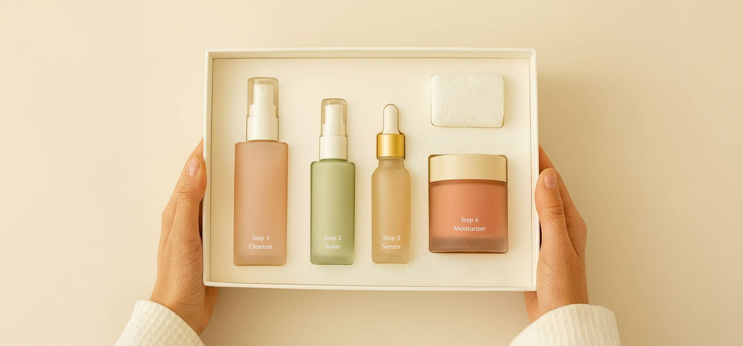
The shape and capacity of the container represent the first factor of physical recognition. In a multi-step routine, each reference should have a format that reflects its function:
- slender bottles: ideal for toners and serums. The thin, elongated format conveys precision and lightness, making it easy to grip during application. In addition, it allows you to dose small quantities of product, typical of concentrated serums;
- jars or tubes: perfect for creams (day, night, eye contour). The pots can be designed with a large diameter and a low height, while the tubes are convenient for more targeted and hygienic pantries;
- mini-formats: essential for products such as eye contour, boosters or intensive treatments. These small packs are handy, portable and perfect for sample or travel size;
- airless formats: recommended for unstable or oxidation-sensitive formulas, such as many serums and face oils. Airless packaging avoids contact with air, preserving the effectiveness of the ingredients.
It is important to avoid the visual monotony effect, i.e. to use the same pack for the entire range without any variations, unless functional differences are introduced (for example, a basic shape that changes slightly in height or diameter depending on the function). The variation in geometry helps to make the user understand, already by touch and sight, which product he is handling.
Colors and color coding
Color is a very powerful communication tool. In a multi-step routine, the adoption of a color-coding system helps guide the user and create a consistent visual “family” effect.
- Distinct colors for each step: you can decide to associate each step with a specific shade. For example: blue for the cleanser (feeling of freshness and purity), green for the toner (reference to nature and hydration), gold or copper for the serum (enhancement of the product as a “golden treatment”), a soft pink for the day cream (delicacy and brightness) and a matte white or light gray for the eye contour (feeling of cleanliness and lightness);
- progressive hues: use different shades of the same color to indicate a level of intensity or progression in your routine. For example, a lighter green for moisturizer and a darker green for night cream, suggesting a change in density or time of use;
- unified palette with accents: keep a main palette (e.g., neutral beige, black, and white) and introduce accent color only on distinctive elements (cap, label, border) to highlight the function. This approach is useful for limited collections or for skincare dedicated to specific targets (different age groups or gender targets).
Chromatic consistency within the line must be preserved through the use of nuances belonging to the same family, with calibrated hue and saturation values. In this way, each reference stands out without denying that it belongs to the same range.
Distinctive decorations or details
In addition to shape and color, graphic details and decorations can further facilitate product recognition:
- step numbering: apply a system of numbers (1, 2, 3…) clearly visible on the label or cap to indicate in which order to use the products;
- minimal icons or symbols: add small illustrations that refer to the function of the product, such as a drop for the serum, a leaf for the toner, a sun for the day cream, a moon for the night cream;
- different textures and finishes: distinguish each reference with a slightly different pattern, such as a striped embossed texture, a punched texture or a raised geometric pattern, applied to the cap or label.
A calibrated use of these details avoids weighing down the graphics and, at the same time, makes the line more intuitive, especially for users who make hasty purchases or use products in the dark (for example early in the morning or late at night).
Every step has its function, every product its packaging.
Maintain visual consistency in the line
While differentiating each package by function and design, it is essential to maintain an element of continuity that allows the user to recognize at a glance that all products belong to the same range and are designed to be used together. An effective way is to start from a common basic shape, declining it in slightly different variants of height or diameter to adapt to each step, without betraying the original aesthetics. At the same time, graphic design must follow a repetitive pattern: the same font, the same arrangement of logo, name and description, and an identical hierarchy of information, so that even color, texture or icons vary but within a homogeneous framework. Finally, the choice of materials and finishes keeps this visual unity alive: if one bottle is made of satin PET, the other packs will also have to use plastics or similar finishes to ensure a uniform tactile perception. In this way, the “collection” effect is obtained: a distinctive, coherent and immediately recognizable line, which communicates professionalism and invites the consumer to complete the entire skincare process.
Sustainability in multi-step skincare packaging
The growing sensitivity of consumers towards the environment pushes brands to design cosmetic lines for a sustainable beauty routine: from the adoption of refillable modular packaging, which drastically reduces plastic waste, to the choice of mono-material and recyclable materials such as regenerated glass and PCR plastic; from the reduction of unnecessary components through screen printing or direct engraving instead of PVC labels, to the use of water-based inks and eco-friendly paints to minimize VOC emissions. Informing the consumer with clear messages – such as “100% recyclable” or “refills available” – increases transparency and strengthens the perception of social responsibility of the brand, consolidating the trust of an increasingly attentive public to green choices.
Designing packaging with Eurovetrocap
In summary, a skincare packaging design designed for a multi-step routine must combine several elements: visual differentiation to guide the user, graphic consistency to consolidate brand identity, functionality to ensure ease of daily use and sustainability to meet environmental expectations.
Do you want to design a complete skincare line? Explore our catalog and
contact us for personalized advice: we help you design harmonious, distinctive packaging ready to tell your skincare routine step-by-step, even on small batches.