In the current cosmetics packaging scenario, the concept of inclusivity is redefining design criteria. It is no longer simply a matter of packaging a product, but of designing a wrapper capable of providing an intuitive, barrier-free user experience designed to accommodate an audience with diverse needs and expectations. In recent decades, the focus has shifted toward materials and manufacturing processes that combine functionality, aesthetics, and sustainability, with the goal of meeting needs for readability, easy grip, and reduced environmental impact. In this context, manufacturers are called upon to adopt a multidisciplinary approach, including ergonomic studies, analysis of usage flows, and development of tactical solutions such as non-slip surfaces, contoured shapes, and matte finishes, in order to ensure inclusive and versatile design.
Standards and best practices for accessible packaging
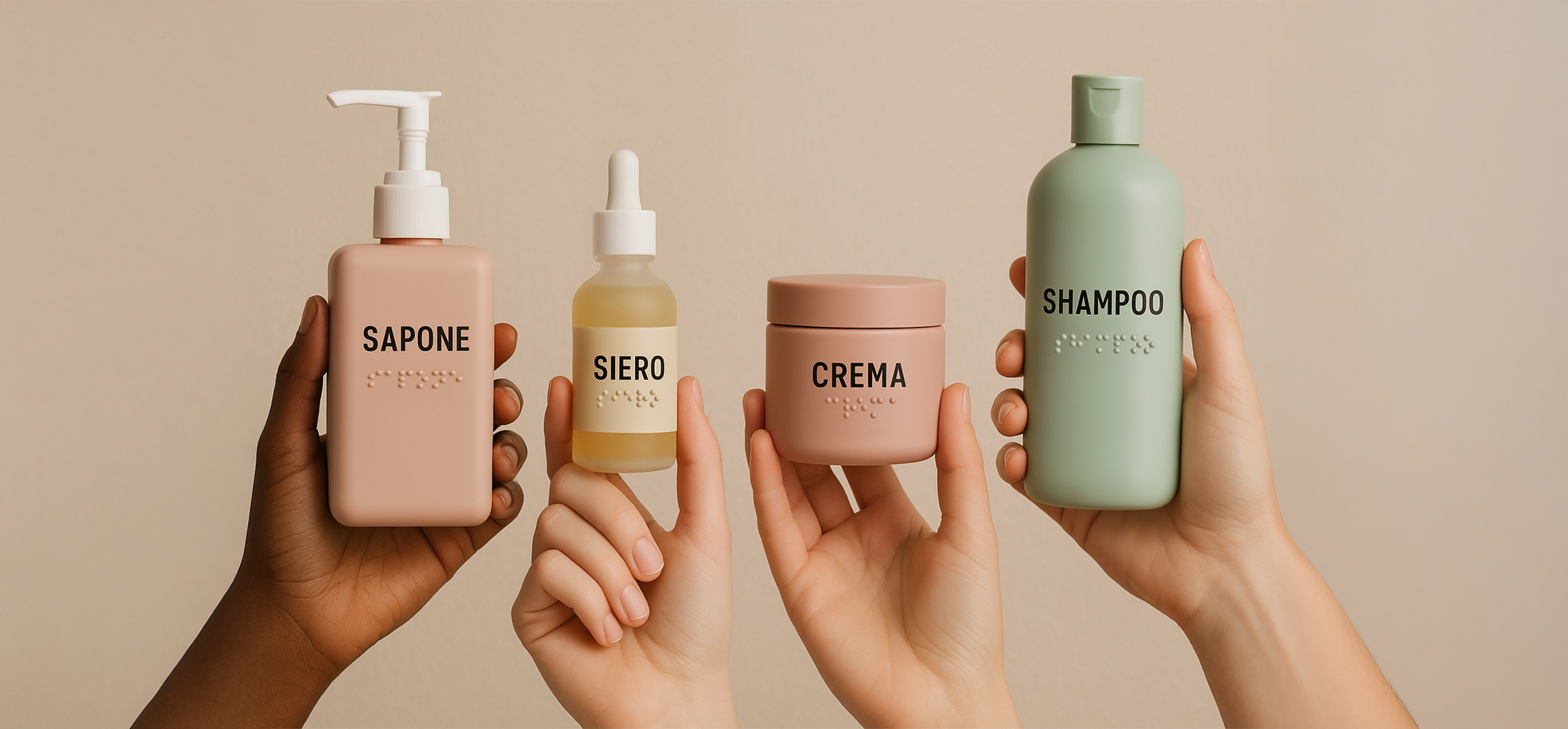
To design truly accessible packaging, it is essential to delve into the regulatory requirements and guidelines that ensure its effectiveness. The EU Product Accessibility Directive defines stringent criteria for the visual and tactile characteristics of packaging, while ISO 21542 standards-even though born for the construction industry-offer valuable guidance on ergonomic shapes and surfaces, which are also useful in container design. In parallel, WCAG 2.1 guidelines, now increasingly applied to digital media, suggest taking into account elements such as QR codes embedded on labels to ensure access to additional information usable by smartphones, screen readers and other aids.
On the tactile level, the insertion of Braille labels must adhere to specific techniques of relief, spacing, and contrast with the surface, allowing quick and accurate recognition of essential data. Visually, the contrast ratio between text and background cannot fall below 4.5:1 for plain text and 3:1 for large text, in accordance with WCAG recommendations, so as to facilitate people with different types of low vision and color blindness.
No less important is attention to the readability of information: sans-serif fonts of at least 12 point and adequate line height are recommended to avoid “crowding” effects in the text. For those with mobility impairments, surfaces should provide sufficient grip through non-slip coatings or matte finishes, while the shapes of the containers should be designed to fit average hand sizes, with ergonomic contours to facilitate grip and opening.
All of these practices, in addition to meeting regulatory obligations, constitute a real opportunity for innovation.
Why choose gender-neutral design
The cultural shift regarding gender identities is profoundly redefining the relationship between brands and consumers, prompting cosmetic companies to entirely rethink their visual and communicative language. A gender-neutral packaging is characterized not only by the absence of male or female color references, but also by a design approach that puts the user experience at the center: it is a concept that can convey effectiveness, concreteness and versatility in a universal way, avoiding stereotypes and simplifying the choice process for the user.
In practice, this type of design involves essential silhouettes with sharp geometric shapes and surfaces devoid of excessive decorative elements. The color palette is based on natural shades, such as stone gray, sand, and olive green, accompanied by matte or satin surfaces that promote a soft yet sophisticated tactile experience. The use of sans-serif fonts, characterized by clean, legible lines, ensures immediate and unambiguous communication, while embossed or tone-on-tone textures allow for the addition of a contemporary touch without compromising the overall neutrality.
Functionally, gender-neutral packaging translates into a modular and scalable design: elements such as closures, dispensers, and handles are designed to adapt to different formats and product types, reducing production complexity and improving the consistency of visual identity. In addition, placing a focus on brand values-such as sustainability, innovation, and inclusiveness-strengthens the connection with an increasingly diverse audience, creating a modern and authentic image that crosses gender barriers.
Inclusive packaging, design that speaks all languages
Inclusiveness and sustainability: two sides of the same coin
Many brands that embrace an inclusive design approach recognize the adoption of sustainable practices as a natural consequence. In this context, recyclable packaging-both glass and easily separable plastics-is the first step in reducing environmental impact. Alongside this choice, refillable (refill) design allows the life cycle of the container to be extended, offering the consumer the opportunity to reuse and refill the pack with ease.
Decorations, when not essential, are made lighter or eliminated altogether: this simplifies the recycling process and improves its efficiency. This minimalist approach perfectly complements essential, gender-neutral design, demonstrating that clean aesthetics are not only compatible with green values, but can also become a distinctive and recognizable element in the marketplace.
Develop solutions for ergonomics and motor accessibility
Inclusive packaging must focus on the needs of those living with motor disabilities or reduced grip strength, because ease of use is a key aspect of the user experience. Ergonomic caps, for example, can be equipped with wider levers and contoured handles, so as to allow a stable grip and easy opening even with limited movement. The design of non-slip surfaces or the application of soft-touch finishes also helps ensure a secure grip, reducing the risk of accidental slips and falls.
Similarly, spray dispensers are designed with mechanisms that require minimal pressure: levers that can be operated with a single finger, low-friction joints, and balanced geometries reduce the force required to dispense the product. This approach is especially useful for people with conditions that limit manual strength or dexterity. Thinking about tactile “feedback” at the end of dispensing-a slight click or change in resistance-ultimately helps to communicate the amount of product dispensed, improving control of dispensing.
For pumps intended for creams and lotions, the caliber of the jet and the smoothness of the piston’s flow are designed to ensure constant and homogeneous dispensing, avoiding waste or sudden spillage. Moving parts are tested over thousands of cycles to ensure their durability and reliability over time, even under heavy use.
On the shape front, the containers feature soft profiles and light curves that follow the average hand conformation; heights and diameters are sized for an optimal balance between stability and lightness. Travel size formats are not simply miniaturizations, but redesigned versions that maintain ergonomic proportions and durable materials, ideal for travel and activities away from home.
Finally, providing for modular elements, such as interchangeable inserts or removable parts, allows for further customization of the packaging according to the user’s motor skills, offering solutions that adapt to different needs without compromising aesthetics and design consistency.
Examples of innovative applications and implementation insights
In the cosmetics industry, many companies are already experimenting with advanced and innovative solutions: thermoformed embossed labels for Braille, lightweight glass bottles with frosted surface to promote friction and elegance, and soft rubber inserts around grip areas. Other manufacturers are adopting removable molded handles or modular dispensers compatible with multiple product formats, reducing waste and increasing versatility. These innovations demonstrate how an inclusive approach can translate into real functionality without sacrificing design.
Competitive advantages of inclusive packaging
Adopting an inclusive and gender-neutral packaging philosophy means investing in solutions that enrich brand reputation, enhance user experience and open up new market segments. By choosing Eurovetrocap, you can count on more than 30 years of expertise in glass, plastic, and aluminum processing, supported by custom screen printing and customization services.
Our in-house eco-design laboratory ensures an integrated approach that combines aesthetics, functionality, regulatory compliance and sustainability. Choose Eurovetrocap as your partner for packaging that is inclusive, accessible and perfectly aligned with your brand values, ready to conquer tomorrow’s market.