
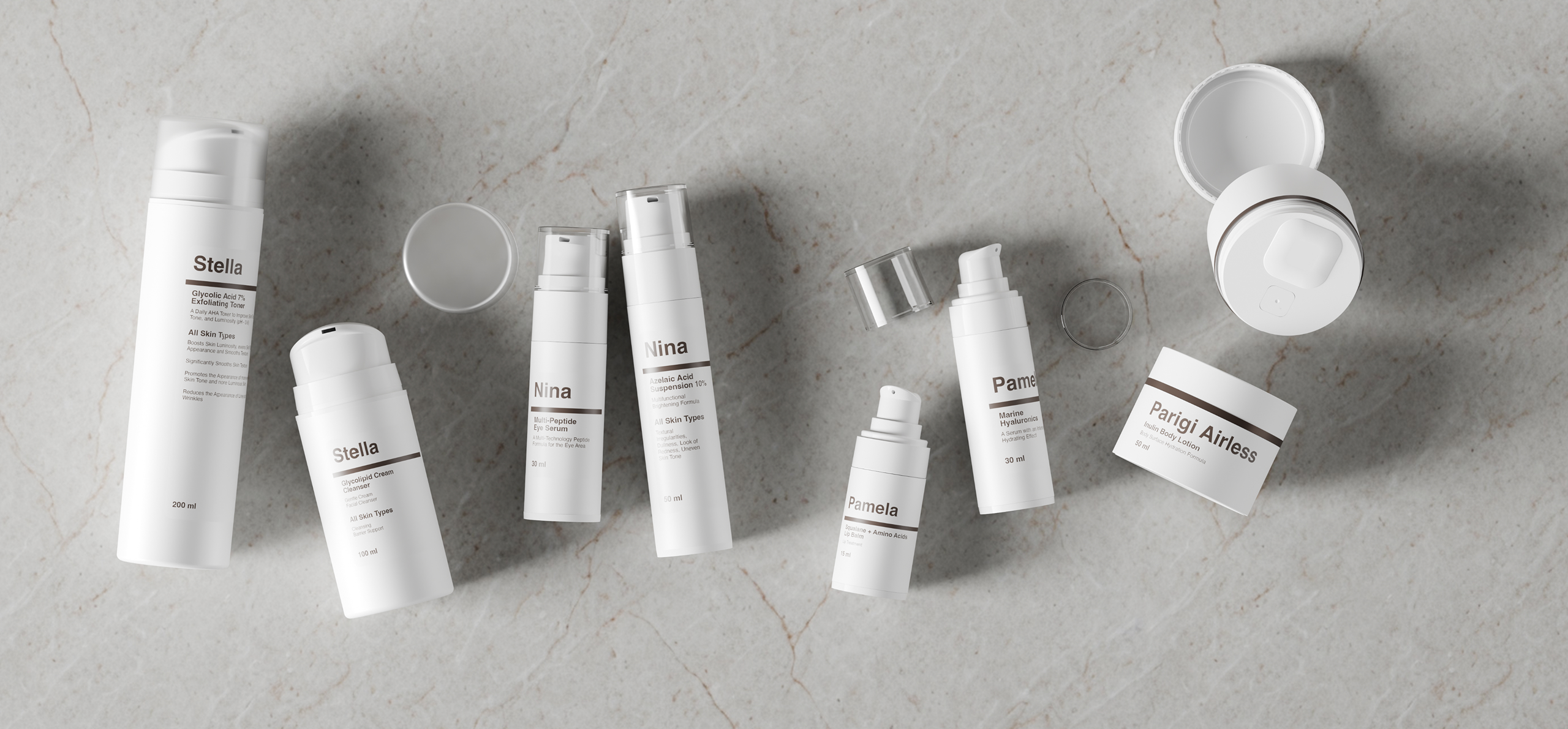
In recent years, a growing share of the cosmetics market has moved closer to pharmaceutical aesthetics. Products that look as though they have come straight from a laboratory, amber glass bottles, calibrated droppers, minimalist labels with clearly visible INCI lists, and claims that evoke clinical precision. This shift is not accidental: it reflects a profound change in consumer expectations. Consumers are increasingly well informed, attentive to ingredients, and drawn to the concept of skinification, meaning an approach to skincare that applies the same level of care and seriousness as choosing a medicine.
For cosmetic brands and companies that manufacture or distribute products through professional channels, pharmacies, and para-pharmacies, this means making highly strategic packaging choices. Achieving a pharmaceutical look for cosmetics is not as simple as selecting the first white bottle available. It requires a thorough understanding of pharmaceutical visual codes, the right materials, and the regulations governing the communication of products positioned at the intersection of cosmetics and healthcare.
What is the pharmaceutical look in cosmetics?
The term pharmaceutical packaging for cosmetics refers to an aesthetic approach that borrows the visual codes of scientific credibility from the pharmaceutical industry while remaining firmly within the cosmetics sector. It is not about imitating a medicinal product or making therapeutic claims, as doing so would constitute a serious regulatory violation. Instead, it involves adopting a visual language that conveys trust, scientific rigour, and positions the product within a premium, science-driven market segment.
This approach is reflected in three parallel trends. The first is dermocosmetics and cosmeceuticals: products formulated with highly concentrated active ingredients – such as retinol, acids, peptides and stabilised vitamin C – primarily distributed through pharmacies and para-pharmacies, where the retail environment already reflects a clinical aesthetic. The second is skinification: a trend driven largely by younger consumers who take a systematic, almost medical approach to their skincare routine, selecting products based on active ingredients rather than brand recognition or fragrance. The third is the professional beauty and medical sector, where advanced beauty centres, aesthetic medicine clinics and medical spas require packaging that conveys professionalism to customers who expect more than traditional luxury branding.
Across all three contexts, packaging cannot rely on the visual language of traditional luxury—gold finishes, decorative details or opulent designs. Instead, it must communicate the language of applied science.
The visual codes of medical-wellness packaging
The pharmaceutical look in cosmetics is defined by a precise set of visual choices. This is not a passing trend but a well-established visual language that consumers have learned to associate with scientific quality, efficacy and reliability.
Colour palette
The dominant colours in this segment are white, transparent, amber and cool neutrals such as platinum grey and matte black. White conveys cleanliness and purity, suggesting the absence of unnecessary additives. Transparency communicates honesty, allowing the product itself to speak. Amber protects light-sensitive active ingredients while immediately evoking the visual identity of pharmaceutical products. Cool neutral tones reinforce associations with laboratories, clinical environments and technical expertise.
Elements to avoid in this segment include warm colour palettes, overly vibrant tones, elaborate metallic finishes and coloured transparent materials. Any design feature reminiscent of decorative or indulgent packaging can weaken the product’s scientific credibility.
Shapes and proportions
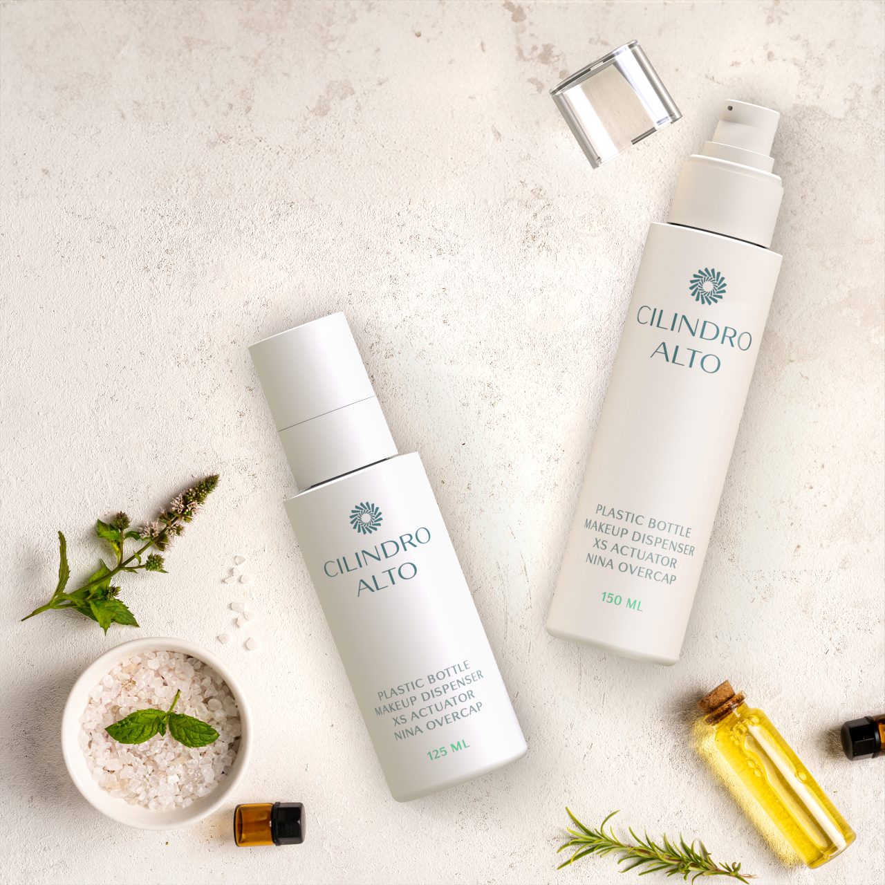
Preferred packaging shapes include cylinders, tall slim silhouettes and rectangular containers with clean, sharp edges. These geometries recall laboratory equipment—such as beakers, test tubes and reagent bottles—and naturally communicate precision and functionality. Compact formats, particularly 15 ml and 30 ml sizes, further reinforce the perception of highly concentrated formulations where a small amount delivers maximum performance.
Typography and graphic design
Label design is clean and essential, free from unnecessary decorative elements. The name of the active ingredient often receives greater visual prominence than the brand name itself. Typography typically features modern sans-serif fonts with generous spacing to maximise readability. The complete INCI list is presented clearly as a sign of transparency, while usage instructions are written in a precise, technical style, specifying concentration, application frequency and the correct order within the skincare routine.
Materials for a pharmaceutical look
Material selection is the first factor that determines the credibility of pharmaceutical-style cosmetic packaging. Not all materials communicate the same message, and choosing the right one plays a crucial role in reinforcing a science-driven brand positioning.
Flint glass (clear glass)
Flint glass is a high-quality clear glass with outstanding optical transparency. Although traditionally associated with luxury fragrances, it is widely used in pharmaceutical-style cosmetic packaging because it showcases the product itself – whether a transparent serum, a bi-phase solution or a micellar water. Transparency becomes a communication tool in its own right: consumers can see exactly what they are buying, with no coloured filters or visual distractions. Flint glass pairs perfectly with white closures, stainless steel or anodised aluminium dispensing systems, and minimalist text-based labels.
Amber glass
Amber glass is the iconic material of the pharmaceutical industry. It protects the contents from UV light, which can degrade light-sensitive active ingredients such as vitamin C, retinol and many botanical extracts. For science-based cosmetic formulations, this is often a functional choice before it is an aesthetic one: if the formula contains light-sensitive actives, amber glass is technically the most appropriate solution. At the same time, it delivers an unmistakable visual identity. A 30 ml amber glass bottle with a white label and pipette dropper immediately positions a product within the clinical and professional skincare segment. Type I borosilicate glass – the same material used for pharmaceutical injectable vials – offers exceptional chemical inertness, making it ideal for formulations with extreme pH levels.
Aluminium
In medical and professional cosmetics, aluminium is primarily used for tubes, spray bottles and compact packaging formats. It is lightweight, fully recyclable and provides an excellent barrier against light and air. When anodised – a surface treatment that creates a protective oxide layer – it develops a refined matte finish that conveys technical durability without appearing overly industrial. Aluminium is widely associated with professional toothpaste, in-clinic cosmetic products and advanced skincare treatments designed to communicate a serious, science-led positioning.
Technical plastics (PETG, HDPE and ABS)
When plastic is required for reasons of cost, weight or manufacturing processes, the preferred choice should always be high-quality engineering plastics. PETG offers glass-like transparency and can be sterilised, making it suitable for premium cosmetic packaging. HDPE is the standard material for laboratory bottles and pharmaceutical containers, recognised for its durability and chemical resistance. ABS is rigid and can be finished with matte or soft-touch surfaces that reinforce a technical, professional feel. In every case, mono-material packaging should be prioritised to facilitate recycling and ensure compliance with the requirements of the European Packaging and Packaging Waste Regulation (PPWR).
Technical components that convey precision
The pharmaceutical look is shaped not only by the choice of materials but also by the dispensing system. An amber glass bottle fitted with a standard screw cap immediately loses much of its premium scientific positioning. Technical components complete the message, reinforcing the perception of precision, efficacy and reliability.
Pipette droppers and droppers
The calibrated pipette is the ultimate symbol of controlled dispensing. In science-driven cosmetics, it is commonly used for concentrated serums, targeted treatments and high-purity facial oils. A dropper allows consumers to dispense the product one drop at a time, much like a liquid supplement. This application ritual becomes part of the user experience, reinforcing the perception of potency and precision. Models featuring glass pipettes or medical-grade silicone bulbs further enhance the product’s premium positioning.
Airless pumps
Airless bottles are the ideal dispensing solution for formulations containing oxidation-sensitive active ingredients. The airless chamber isolates the formula from air, preserving its stability until the very last dose. For pharmaceutical-style cosmetics, this is often a technical necessity rather than simply a design choice. Formulations rich in retinol, vitamin C or bioactive peptides are particularly susceptible to oxidation and require enhanced protection.
Airless pumps also communicate this technical commitment visually. The product remains sealed, is never touched directly by the user’s fingers, and every dose is dispensed with precision. The preferred format is a white or transparent cylindrical bottle with a capacity of 30–50 ml.
Fixed-dose pumps
Fixed-dose dispenser pumps ensure that each actuation delivers exactly the same amount of product – typically 0.5 ml or 1 ml. This level of dosing accuracy is particularly important for high-concentration formulations, where the correct dosage is part of the product’s perceived effectiveness. Consumers value this precision, while brands can reinforce the pharmaceutical association by indicating on the packaging that “one pump = one recommended daily dose.”
René and Minerbio Mono droppers
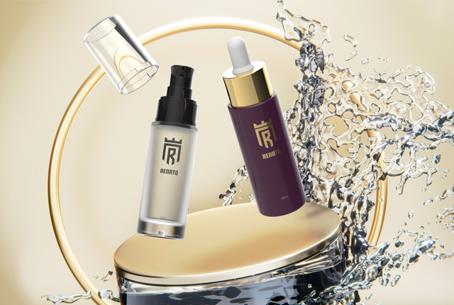
Eurovetrocap manufactures the René and Minerbio Mono precision droppers, designed to deliver a consistent drop size without dripping or product waste, while offering superior flow control compared to standard droppers. For brands seeking to communicate scientific rigour through every aspect of the user experience, these dispensing systems represent the ideal solution.
Pharmaceutical packaging and cosmetic regulations
One of the most important considerations when designing pharmaceutical-style cosmetic packaging concerns regulatory boundaries. A cosmetic product may adopt the visual language of pharmaceuticals without becoming a medicinal product. However, brands must avoid making therapeutic claims that could alter the product’s legal classification.
Regulation (EC) No. 1223/2009 on cosmetic products clearly defines what can and cannot be communicated. Cosmetic products may cleanse, perfume, protect, maintain or improve the appearance of the skin. They cannot claim to treat diseases, modify biological functions or exert pharmacological effects. Consequently, using terms such as cure, treatment or therapy in relation to a cosmetic product may create regulatory compliance issues. Safer alternatives include expressions such as skincare routine, protocol or care programme, which accurately describe cosmetic use without implying medicinal properties.
Production quality standards applicable to professional cosmetics—such as ISO 22716 and Cosmetic Good Manufacturing Practices (GMP)—provide another legitimate way to strengthen brand positioning. Communicating that a product is manufactured in accordance with Cosmetic GMP is a verifiable and value-enhancing claim that remains fully compliant with cosmetic regulations. Likewise, rigorous packaging quality control forms an integral part of this science-driven positioning.
The metabolic beauty trend and its connection to the pharmaceutical look
Metabolic Beauty is one of the most frequently cited emerging trends in cosmetic industry forecasts for the 2026–2030 period. The concept is based on the idea that beauty is no longer viewed as merely a matter of surface aesthetics, but as the visible result of internal metabolic processes, including cellular longevity, biohacking, skin microbiome balance and hormonal health. Brands operating in this space increasingly adopt concepts such as “longevity skincare,” “skin optimization,” and “evidence-based beauty.”
Pharmaceutical-style packaging is the natural visual language for this positioning. A brand claiming to support the skin’s metabolic processes cannot present itself in a pink bottle with gold embellishments; instead, it must embrace the visual codes of applied science. Amber glass, airless dispensers, labels featuring a detailed INCI list and clearly stated active concentrations, together with compact packaging formats, all reinforce this identity. In this context, packaging becomes tangible proof of the credibility behind the brand’s claims.
This connection between the pharmaceutical look and Metabolic Beauty represents one of the most promising opportunities for B2B brands seeking differentiation. Rather than following a temporary aesthetic trend, the goal is to build a consistent communication strategy in which the product, packaging, claims and distribution channel all support the same scientific positioning.
Eurovetrocap solutions for pharmaceutical packaging
For more than thirty years, Eurovetrocap has partnered with cosmetic brands operating in the professional, pharmaceutical and medical-wellness sectors. Our product portfolio includes dedicated packaging solutions for brands seeking a science-driven positioning without compromising on manufacturing quality or customisation.
Our Pharma product range features both flint and amber glass bottles suitable for technical fragrance applications as well as advanced skincare formulations. The Klee and Laura collections offer elegant cylindrical and slim-profile designs that are particularly well suited to the medical-wellness aesthetic. For precision dispensing, our technical team can help you select the most appropriate solution from pipettes, René and Minerbio Mono droppers, XS dispenser pumps and Aria Luxe airless systems.
Whether you are developing a pharmaceutical-style skincare line from the initial container selection through to the final visual identity, our specialists are available to provide tailored technical advice and help you choose the packaging solution that best reflects your brand positioning.
Are you developing a cosmetic line for pharmacies, aesthetic clinics or science-led retail channels? Contact us to explore the materials, components and finishes that best support your brand positioning.


