When developing a line of professional face and body products, thinking about the concept and then the packaging design is a choice that goes hand in hand with all pre-launch strategic activities. Packaging has never been merely a container for cosmetics and today, with ever-increasing awareness, it is clear that it represents the spearhead of brand perception, user experience and the recognisability of each product.
In the case of professional natural lines, suitable for both home and beauty salon use, the packaging must combine aesthetics, ergonomics and clarity of use. The challenge, as we will explore in this article, is to balance three key factors:
- visual consistency, to convey a unique identity;
- specific functionality, tailored to the needs of the face and body;
- effective differentiation, to help the user recognise the function of each product at a glance.
Face vs body lines: different needs, common goal
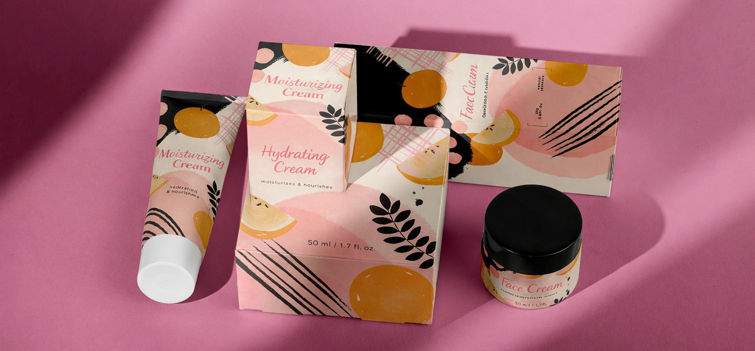
Even if they are part of the same brand or range, natural cosmetics for the face, body and hair have very different usage requirements, which must be considered from the earliest stages of packaging design. The format, dispensing system, materials and even frequency of use all influence the choice of the ideal container. To design a truly effective line, it is therefore essential to understand and respect these differences, while maintaining a common thread that gives visual consistency to the entire range.
For example, face products require more compact bottles, usually between 15 and 50 ml, which offer precise and controlled dosing. Lightweight, refined materials such as frosted glass (including recycled), such as the Laura 15 ml bottle, or transparent PET are preferred, as they are ideal for conveying delicacy and purity. The aesthetics also tend to be minimalist, with understated finishes that evoke the idea of care and attention. Furthermore, as these are products that are used more frequently, often several times a day, the packaging must be ergonomic and easy to use with one hand.
Body products, on the other hand, require more generous formats, from 200 to 500 ml, to ensure comfortable use on larger areas of the body. In this case, the dosage must be practical and generous, supported by larger dispensing systems such as wide pumps or snap caps. The materials must offer robustness and practicality, such as the 250 ml Carven PP jar, and the exterior appearance can afford a more welcoming and substantial image.
In short, the packaging must make the intended use immediately clear, even if, despite their diversity, both must belong to the same “visual family”. Stylistic consistency between face and body products is essential: it helps to strengthen the brand’s positioning and naturally guides the user in their daily routine.
Consistency between face and body products
A well-designed line can convey a harmonious universe, while still offering clear differentiation. Here are some effective tips:
Use “sister” shapes: choose containers with the same formal style, but in different proportions. A slender 30 ml cylindrical bottle for a face serum and a wider 250 ml bottle for a body cream convey consistency while suggesting distinct uses.
Work on coordinated colours and materials: using a common colour palette is an excellent starting point. Variations in opacity, transparency or texture can differentiate categories without compromising visual identity. The material – frosted glass, opaque plastic or coloured PET – can also be a guiding element.
Customise decorations: visual information is essential in a professional context. Maintain the same graphic style (font, size, logo), but vary the layout slightly or insert functional icons to suggest the intended use (face/body). This helps customers and operators to quickly find their way around.
Adapt the dispensing system to the use: the dispensing system must be consistent with the characteristics of the product. For example, for the face, droppers, small pumps, 30-50 ml airless pumps are best; for the body: large pumps, snap caps, large 200-500 ml jars. A technical choice that is also an implicit message about the correct use and value of the content.

A well-designed line can convey a harmonious universe, while still offering clear differentiation.
Coordinated range: an example
Let’s imagine, for example, a natural and professional line designed for a brand that wants to communicate expertise and delicacy through every detail of the packaging. Each product in the range is designed to meet different needs, while maintaining visual consistency and strong recognisability. We start with a face serum, perhaps in a 30 ml airless bottle in a neutral colour, embellished with silver screen printing that conveys elegance and cleanliness. We continue with a face cream, housed in a 50 ml jar that uses the same material and finish, ensuring stylistic continuity.
For body products, we move on to more generous formats: a cream in a 250 ml bottle with a dispenser pump, useful for quick and controlled dosing even in professional environments, and a scrub contained in a 300 ml jar with a flat cap and wide opening to facilitate product removal.
The result is a harmonious, elegant and easily navigable range that speaks a consistent language but is modulated to the different stages of the skincare and bodycare routine.
The importance of sustainability
In the professional channel, packaging takes on a role that goes far beyond its primary function of containing the product. It becomes a true everyday ally, a silent but powerful tool that builds relationships and trust between the brand and those who use it, both operators and end customers. That is why, when designing natural face and body cosmetics, it is essential to ensure consistency on an environmental level. Some winning strategies:
- the same material for all packaging, to facilitate recycling;
- direct or easily separable decorations (silk-screen printing on glass, removable labels);
- refills compatible between different products (e.g. the same neck for face and body bottles);
- reduction in the number of components to simplify disposal.
Packaging speaks: it says who you are, what you promise and how you keep that promise. Every opening, every gesture of use must be fluid, safe and intuitive. The container thus becomes a protagonist of the experience, capable of conveying care, competence and consistency from the very first glance and the very first contact.
In addition, a range designed with circularity in mind improves production efficiency and conveys values consistent with the brand’s green identity.
Create face and body lines with Eurovetrocap
With over 30 years of experience in cosmetics packaging, Eurovetrocap offers a wide range of coordinated solutions for skincare and bodycare. Bottles, jars, airless containers, caps and pumps: every component is designed to be compatible, customisable and technically efficient.
Whether you are developing a natural line for the professional channel or a retail collection for everyday use, we can help you:
- choose sustainable materials that are consistent across the entire range;
- coordinate formats and finishes, even on small batches;
- define a visual narrative that guides the customer from the beginning to the end of their routine.
Write to us to design a harmonious, functional and valuable face + body line.